Most founders and indie hackers are excellent builders and developers. They create awesome tools for their users. Yet, when it comes to design, they struggle.
This is a problem, because when you use design the right way, it is a superpower that'll increase your MRR a lot.
Is this you? Do you struggle with design and want to learn how to use it better for your SaaS? Keep on reading!

One of the most important things to consider when building your SaaS is cognitive (over)load.
Cognitive load is the effort a user needs to process what's on a page and determine what to do next.
This is super important because being overloaded cognitively can cause users to leave your landing page or stop using your SaaS altogether.
Here's a list of cognitive (over)load examples I see on landing pages and SaaS. How many of these do you have?
Long walls of text.
Visual elements on a landing page battle for the user's attention.
Complex pricing sections.
Complex dashboards without a clear structure.
Long (settings) forms in a SaaS.
The following mistakes all hurt cognitive load (and, because of it, your MRR). I'll also share ways to improve them.
This design mistake is probably the most UI-related item on my list. It is about the fonts you use.
Chances are you're using fonts that are too small. I see it a lot in my SaaS UX reviews.
This is a problem because small font sizes make your text harder to read. That 'wall of text' causes a 'too long didn't read' reaction from your users, which makes them leave your website.
That is really holding back your SaaS because it is likely making your users' jobs-to-be-done much harder than they should be.
If this happens on your landing page, visitors are less likely to sign up because it causes them too much trouble to really understand and process what you are trying to sell.
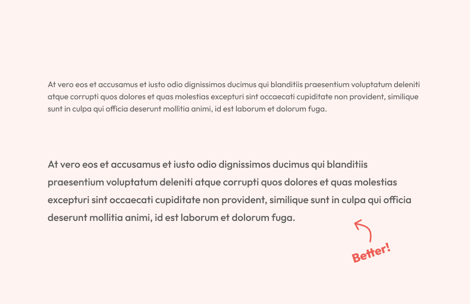
If you want to do better, use font sizes of at least 16px. Go a bit higher (18 or 20px) if it fits your SaaS' style.
Let's look at a few extra ways to improve your text's readability.
Increase the line height to 24 pixels (if you use a 16-pixel font size.)
Increase the font weight for body text to medium.
Take a look at the example below. The second one (higher font size and weight) is much easier to read.
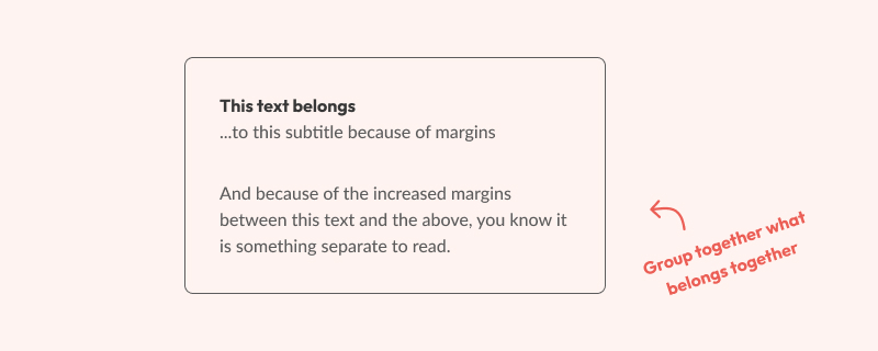
Consistent margins and padding are some of the best ways design can help make an information-heavy page easier for your users to digest.
The sad truth is, however, that the margins and padding of the SaaS I review usually aren't consistent. The inconsistency hurts the hierarchy of your SaaS.
Creating a good hierarchy helps users flow through the page in the correct order. This is especially useful when explaining what you do on a landing page.
In doing so, you will keep more of your users on the platform. And users on your platform equals MRR.
Here's an example of how consistent margins make a set of UI components easier to process.
Up next, we have information scent and how it helps visitors and users of your websites make a decision.
Information scent is based on a metaphor from foragers and how they make their foraging decisions based on smell. If a specific direction smells a certain way, it tells you about what you will likely encounter there.
Apply this to your SaaS, and you can use information scent to move users in the right direction. Here's an example.
When looking at an overview full of resources for people to read, you don't click every item until you find the right one. Instead, you check the image, excerpt, and clickable elements before you decide which resource to click.
An unclear information scent can hold your SaaS back for several reasons.
When users aren't sure where to click, they're more likely to leave your landing page.
Clicking on the wrong element will increase your landing page's bounce rate.
UX writing as a skill is useful here. For example, to help guide your users in the right direction, adding context to your button labels helps a lot.
Instead of using a generic button label like 'next' or 'save,' use a context-aware label like 'submit form for review' or 'next question.'

When you use the latter two, your users have a much better idea of what will happen when they press the button. This decreases the cognitive load, and because of it, the completion rate of a job-to-be-done increases.
This works for landing pages, too. I've seen many landing pages for SaaS where a button says 'try it out,' but when you click it, you are redirected to a sign-up page.
While this is technically true, a better label would be 'sign up for free.' Alternatively, you can let your users try out a (limited) version of your SaaS without signing up.
Duolingo does this in a great way, but more on that below.
One of the best ways to convert a potential user to a paying user is to share an 'aha moment' early in the user flow.
The 'aha moment' is when your users first realize how useful your SaaS is for them and how it will solve their problems.
That moment will make your potential users want to sign up. Also, aha moments allow for a higher cognitive load before a user quits.
It is a superpower for your MRR, yet many founders hide that 'aha moment' behind a long user flow. It is really holding your SaaS back.
An excellent example of using the 'aha moment' to your advantage is Duolingo. They allow you to complete one level of learning a language before you have to sign up.
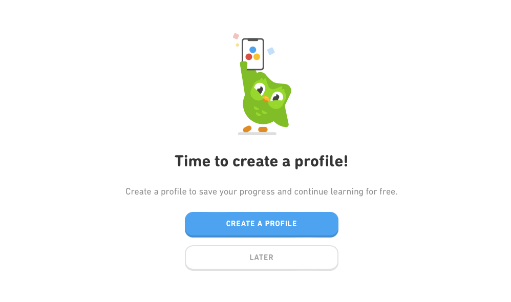
It gives the user a feeling of accomplishment that changes their mindset from 'Ugh, that's a lot of work' to 'Of course I want to sign up!'
That's the power of the 'aha moment'. So, instead of overloading the user with walls of text, unclear buttons, and long forms to fill out, give your users a small preview of how useful your SaaS is. Designing it this way will do wonders for your MRR.
The five design mistakes and how they impact your SaaS I mention above are only the beginning. There's so much more we can do to help your SaaS grow.
I'm working on a UX-for-founders course, but while you wait, you could consider my SaaS UX review service, where I check your SaaS for the above and much more.